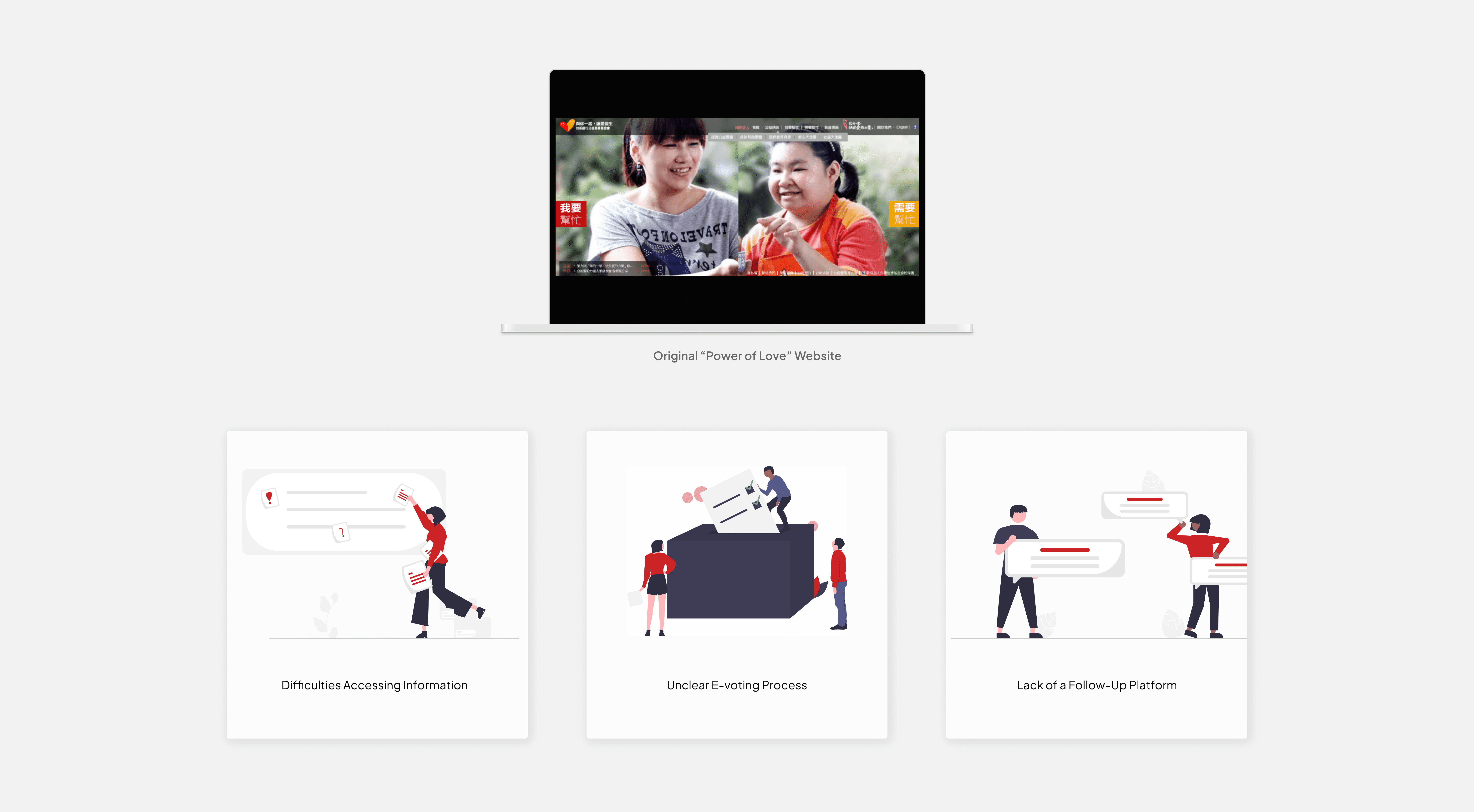
The existing charity website was disconnected from the Taishin Charity Foundation’s official site, resulting in a fragmented user experience and low participation in e-voting campaigns. Users faced difficulties accessing information about non-profit organizations' past activities, and the unclear e-voting process further hindered engagement. The inefficient voting flow and lack of a follow-up platform also discouraged participation. The platform served two distinct user groups: general audience members who voted and donated for charities, and non-profit organizations that posted their proposals to attract sponsors and increase votes.
We discussed with the client marketing team and found out the goal was to integrate the "Power of Love" charity campaign with the official website to create a unified user experience, streamline the voting process, and enhance participation. This included improving access to information for both general users and non-profit organizations, clarifying e-voting steps, and optimizing the voting flow.
We discovered that our client want an effective ways to showcase specific projects or need better tools to communicate impact to potential donors and volunteers. They need a better data tracking and reporting features that help stakeholders manage and analyze engagements more efficiently.
Users desire more immediate confirmation of the impact of their contributions; and also a better voting process to see the results of how the nonprofit organizations have utilized those funds.
We realized that competitors in Taiwan are successfully using features such as regular updates, personalized content, and community-building activities to keep users engaged over the long term.
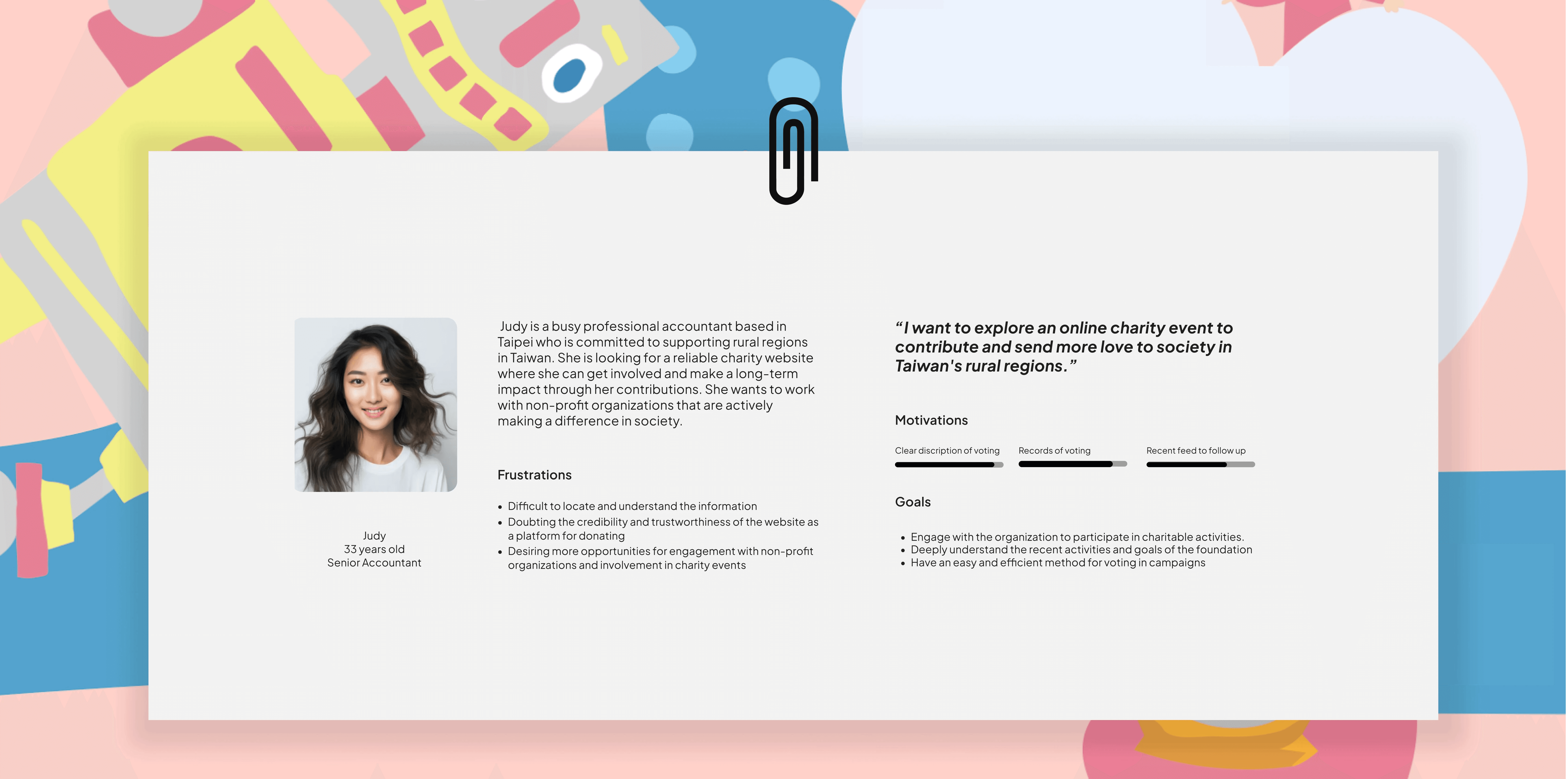
Voting process confusing and time-consuming.
Disconnected from the community and group activities.
Struggle with tracking and knowing their non-profit organization
Enhance user engagement and community connection on the platform by simplifying the voting process and providing more interactive and personalized updates, while improving content customization. This goal will focus on enabling regular users to vote faster and providing nonprofit organizations with better ways to represent themselves to secure more funding. The aim is to make the platform more intuitive, responsive, and aligned with user needs, ultimately increasing participation and strengthening the community around charitable causes in Taiwan.
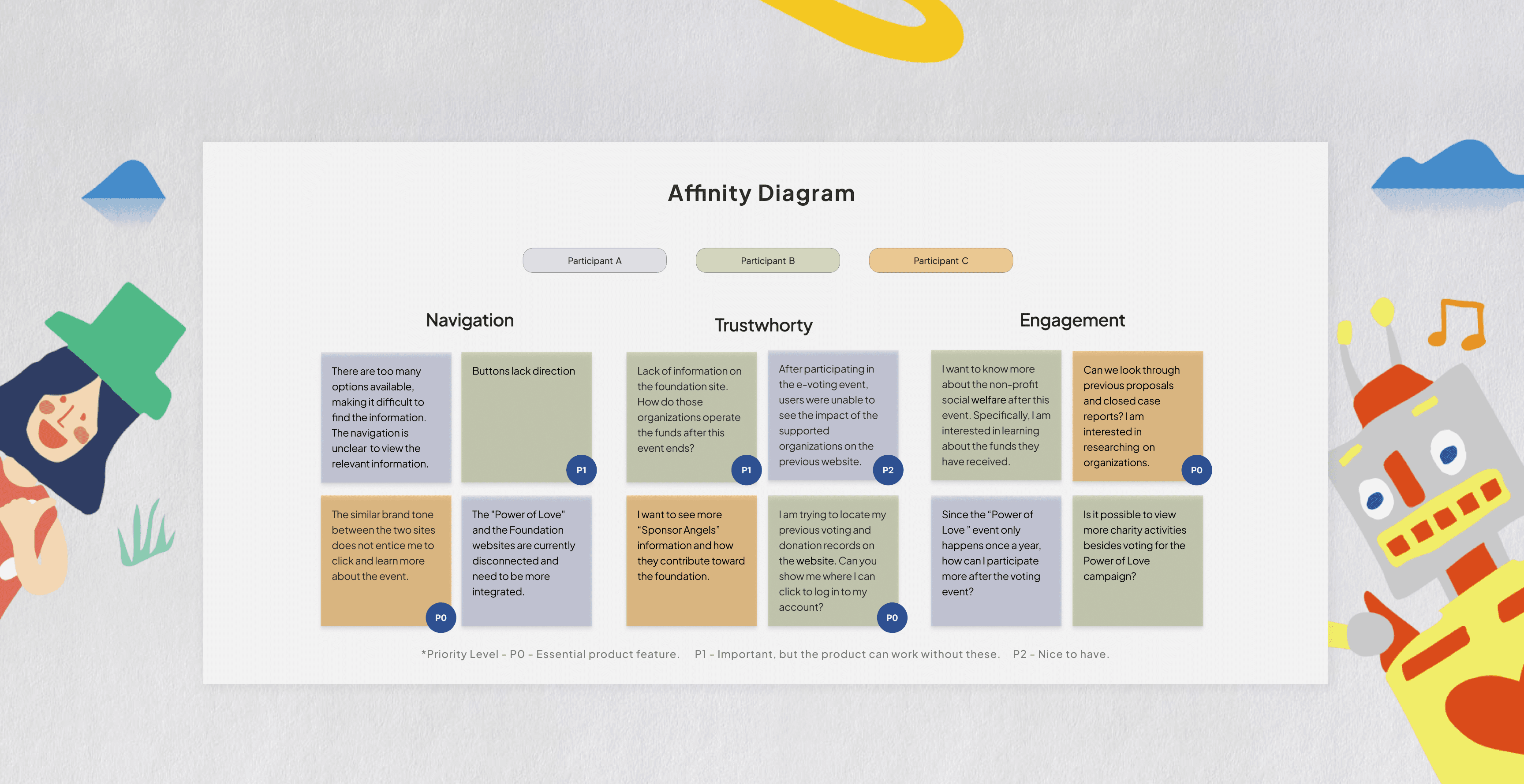
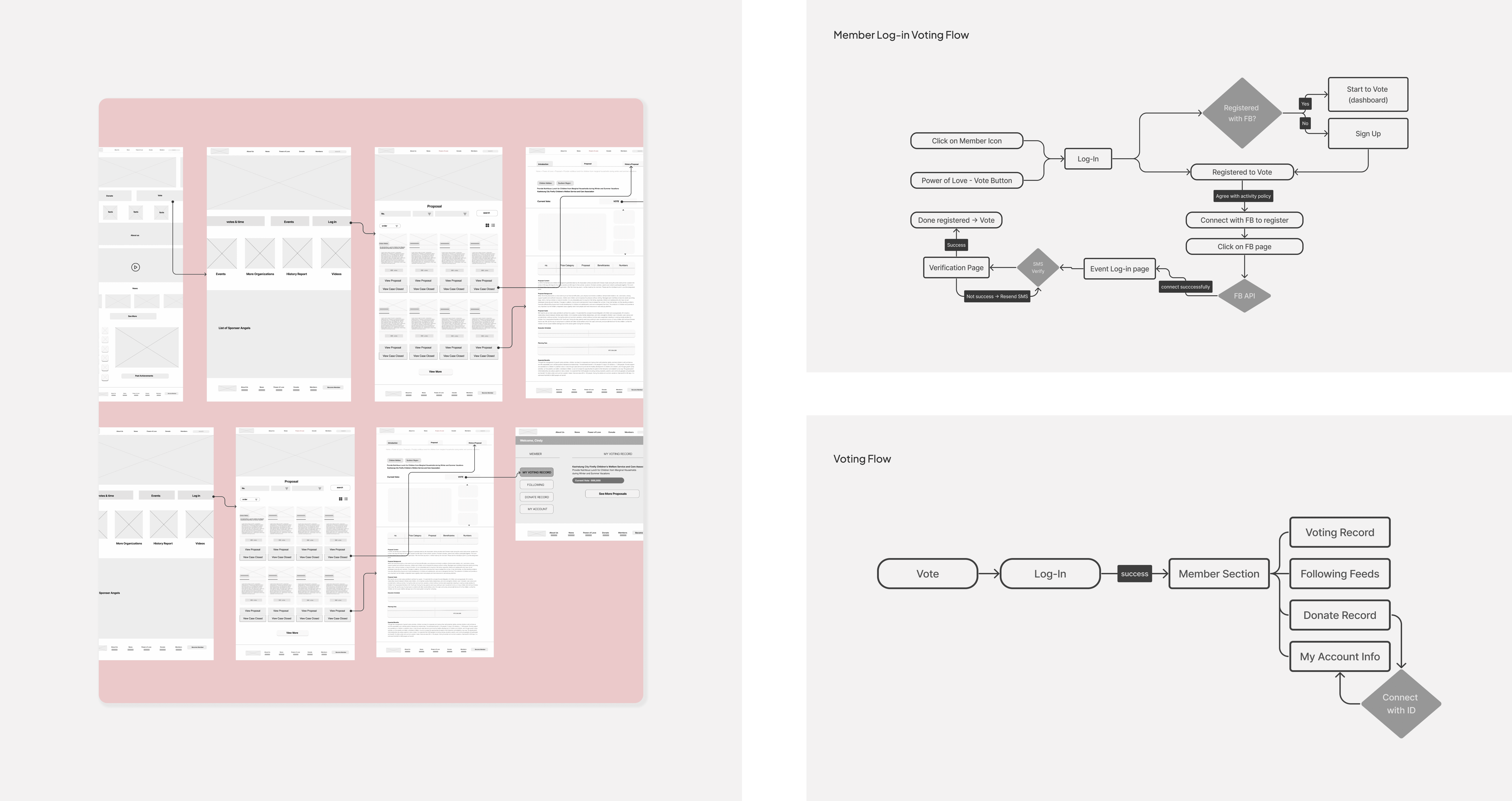
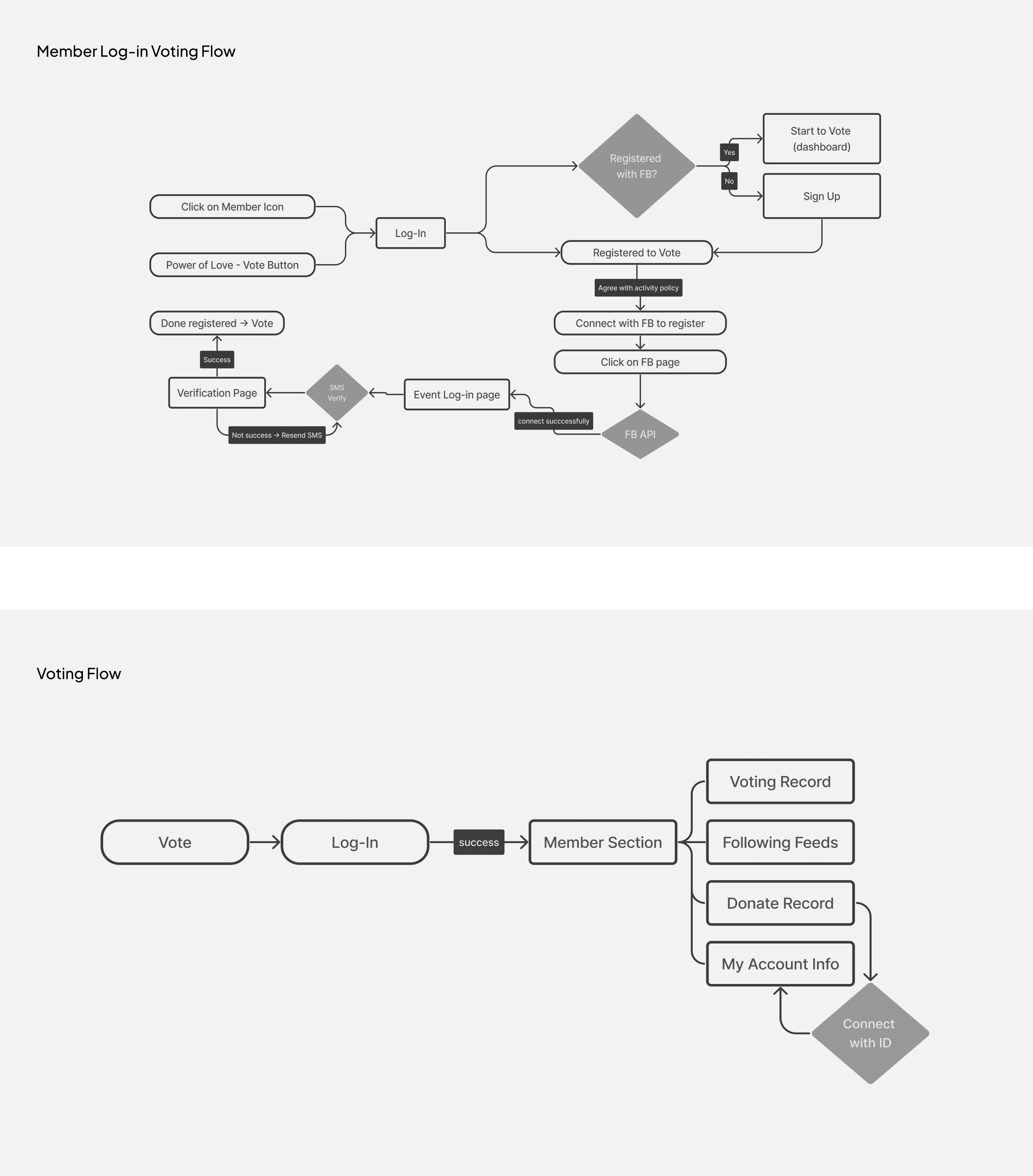
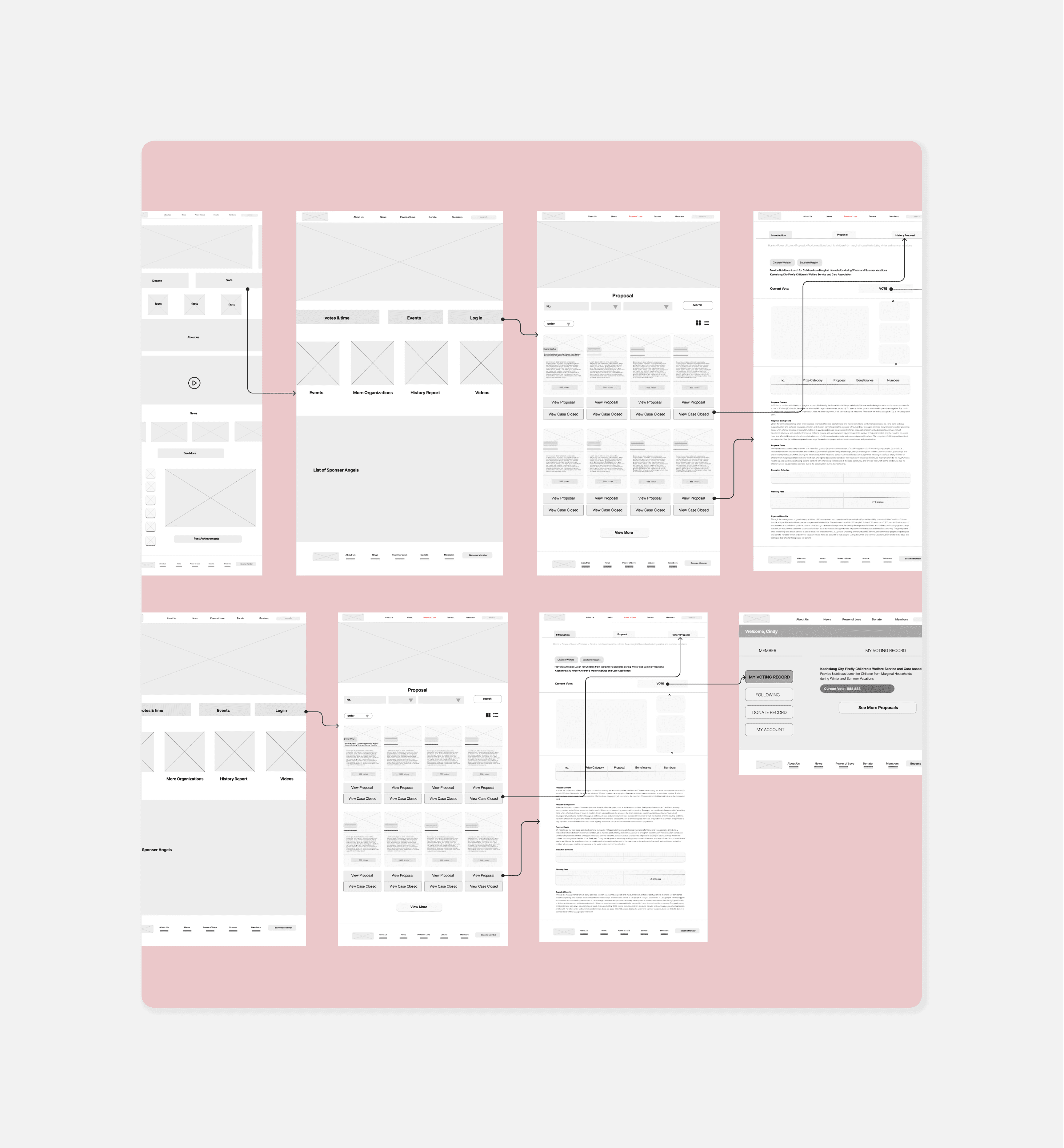
We collaborated with the back-end developers to focus on redesigning the user flow to simplify and expedite the voting process, ensuring that it is intuitive and user-friendly. This includes minimizing the number of steps required to vote, providing clear and concise instructions, and optimizing the layout for various devices.
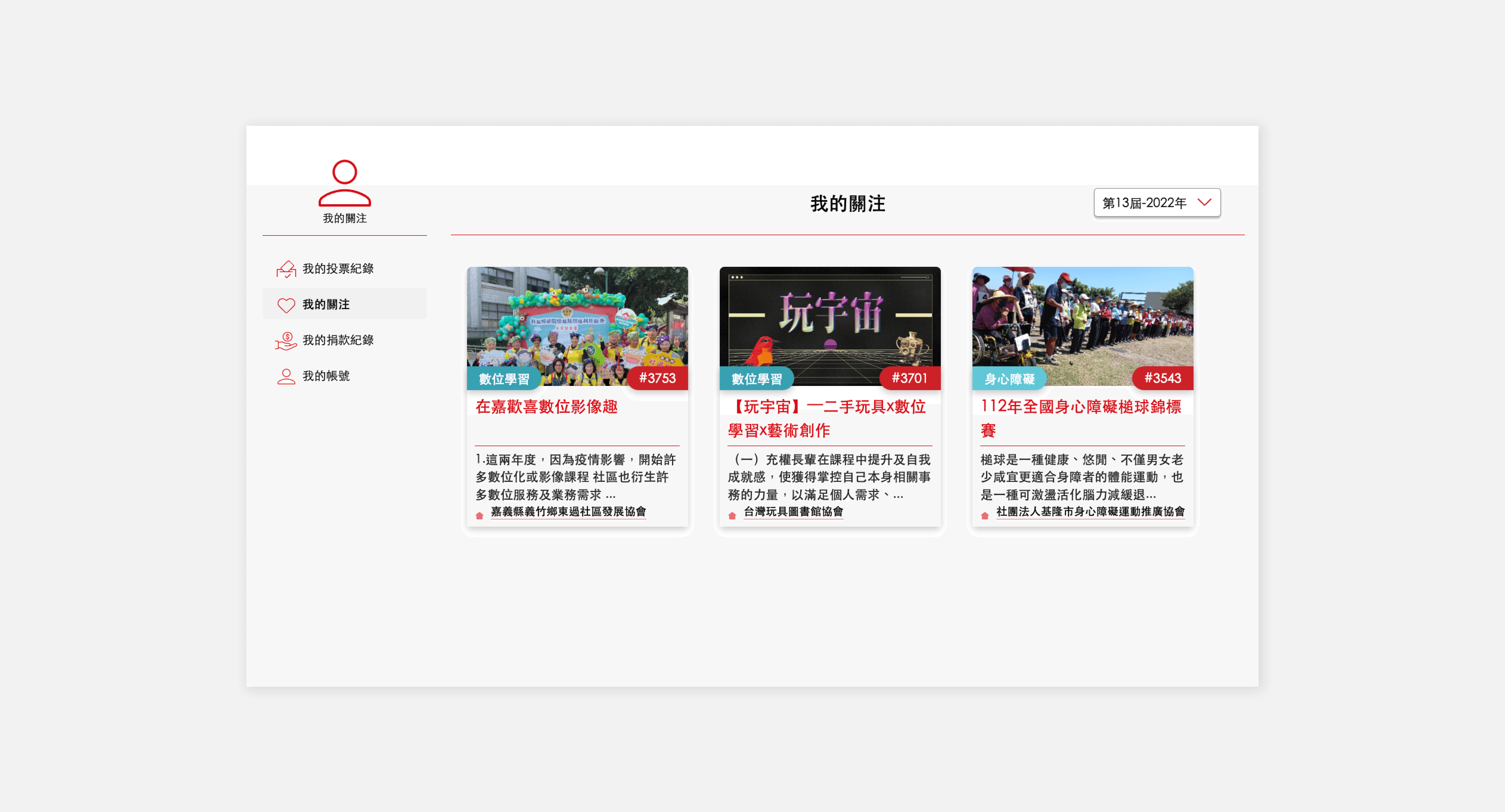
Users struggle with tracking and managing their interests of the group of organizations on the platform.
We develop a robust content management system that allows nonprofit organizations to effectively showcase their missions, achievements, and needs. Enhance the platform with personalization features that tailor content delivery based on user preferences, interaction history, and engagement levels to ensure relevance and increase user retention.
Redesigned the voting experience with a simple, user-friendly flow, integrating social media login for quick access. Users can now easily vote and stay updated through embedded media content, improving participation and awareness.
Introduced a "follow" function with social media integration, allowing users to follow charities and receive personalized media updates through their preferred platforms, boosting real-time community engagement.
Developed a CMS that allows non-profits to post proposals, media, and news, while integrating social media logins for easier management. This enhances their ability to connect with donors and engage a wider audience through social channels.
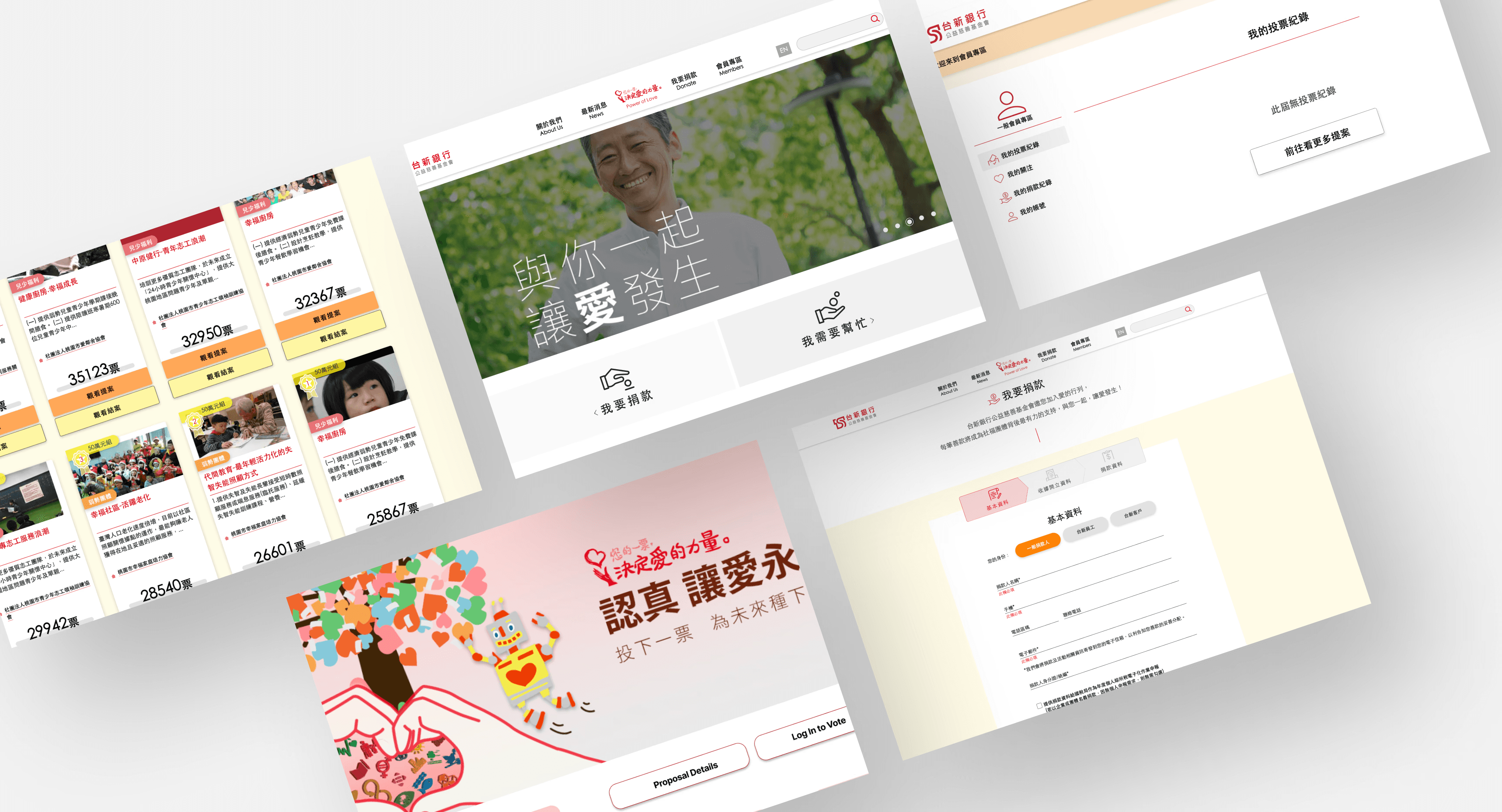
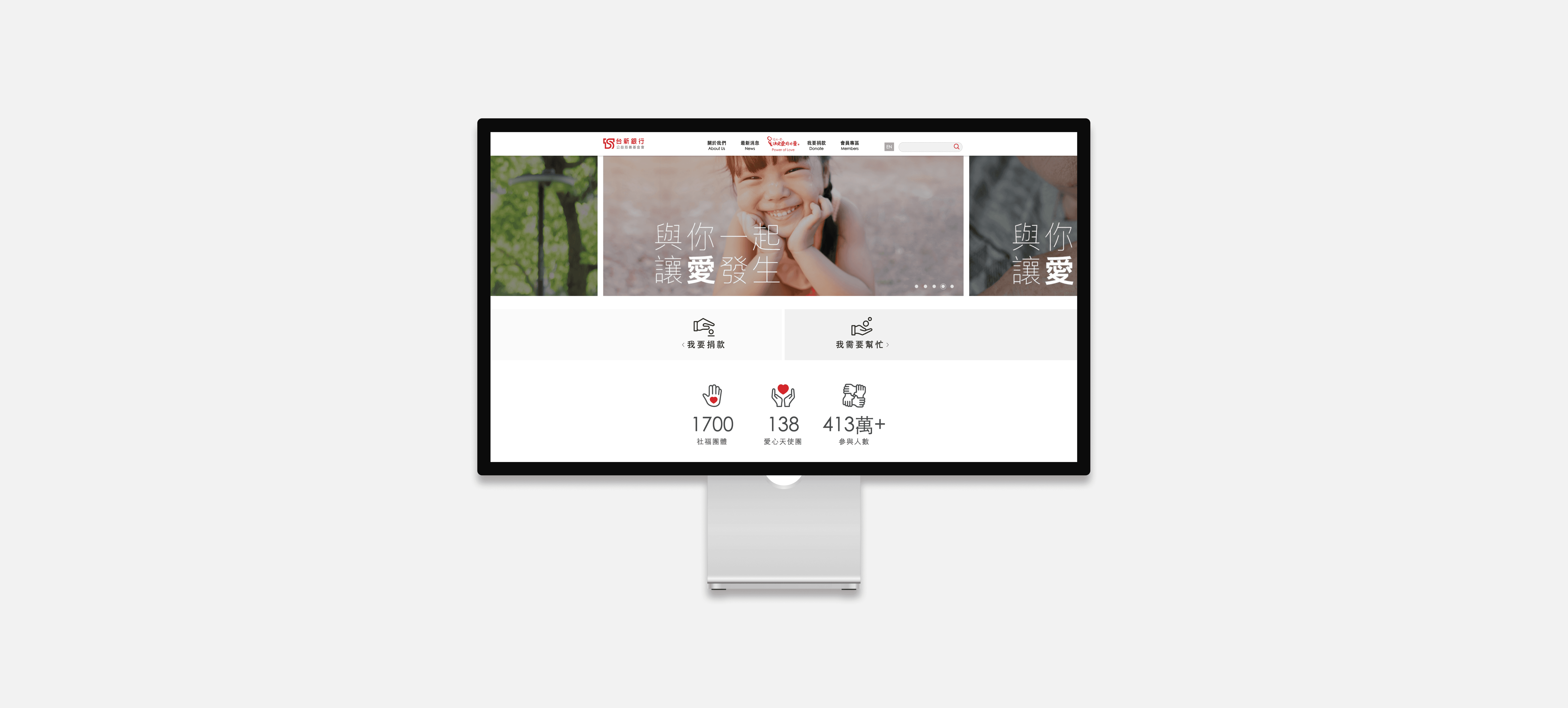
The redesign of the “Power of Love” campaign website for the Taishin Bank Charity Foundation has enhanced the process of community-driven charity selection. This streamlined approach allows users to navigate and choose charities more effectively, directly contributing to the improved user experience.
The redesign enhanced agile collaboration among design, product, and engineering teams, ensuring efficient implementation of new features. This teamwork helped speed up the project and made sure the changes met both user needs and company goals.

